
Covid-19 death rates are higher than reported

Since the beginning of the pandemic the world has turned its attention to Covid-19 data. The most often cited are the counts for new cases or number of deaths. Yet, neither of these figures are completely reliable. During the lockdown in March 2020, Professor of data science and statistics at the ENSAE, Nicolas Chopin took it upon himself to look deeper into the figures provided by French authorities. As others have done around the world, he found that true Covid-19 mortality rates were likely to be higher than those reported.
During the lockdown, you took a look at the pandemic data differently. What did you find?
At the beginning of the pandemic everyone was talking about Covid-19 and I wanted to be helpful in some way. I’m a data scientist so I sought out Open Data. Originally, I wanted to compare the evolution of the pandemic between countries. But very quickly I was confronted with the reality that this isn’t possible. Testing strategies varied enormously between nations – especially at the beginning of the pandemic – so it was obvious that the number of new cases was an unreliable comparison.
Instead, I looked at the number of deaths. Access to the data was actually very easy in France because the two main statistics institutes provide precise data on a daily basis – Santé Publique France (SPF) and Institut National de la Statistique et des Etudes Economiques (INSEE). As the pandemic progressed, they also progressively improved the data made available.
Nevertheless, these figures didn’t quite match up either. What was missing from the data?
First, the SPF provides extensive amounts of data coming from hospitals. However, this is limited to hospital-related information and so only offers data with regards to patients treated at hospitals. Second, the INSEE releases exhaustive data on deaths that have occurred since March 2020, but there is no information in these data on the cause of death. So alone, the data is difficult to interpret. Together, however, they provide valuable insight into the progression of the pandemic in France.
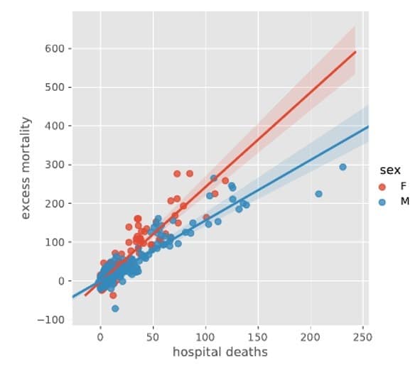
I started by comparing the number of deaths provided by the INSEE in previous years to those of this year. Of course, there was an increase – this is the excess mortality rate, which shows the number of extra deaths compared to the number of expected deaths. And it was 60% higher on average than the recorded Covid-19 deaths provided by the SPF. It is likely that these deaths are mostly due to Covid-19 deaths in elderly retirement homes. But they could be due to related causes, such as lack of treatment for other health problems due to the crisis.
Later, I analysed the same data by separating men and women. Here, I found that the factor for men alone was 1.56 and women was 2.4. This makes sense as there are three times more women than men in retirement homes on average across the country. These institutions are much less equipped to collect and share data, hence the discrepancy in the numbers.
In the end, did this provide you with a way to compare French data to other countries as you had originally hoped for?
I contacted colleagues of mine in Italy, Spain, England and Germany. But no other country could provide me with up to date data like ours. The English equivalent to the SPF, Public Health England (PHE), struggled to keep up to date so much less data was available. In France, we have encountered problems like this in the past. During the summer heat wave in 2003, many elderly people lost their lives. At the time, there was little data available about mortality in the public domain and it was funeral directors who sounded the alarm as they were inundated with funerals. As a result, now the data is readily available.
Your work was only published on your blog, but it still made an impact. Can you tell us more about what happened?
An interesting point is that many people could have done it, not just me. The analysis that I ran is basic enough to have been done by an undergraduate student. Yet, it highlights how much of data science is about having the right data set to study in the first place. There were others like me who came to the same conclusion about how to analyse the data – independently of my analyses. Specialised journalists at the New York Times ran a paper about the excess mortality rate – a story which was also picked up the The Guardian and Le Monde.
For my part, I was invited to a round table at the Académie des Sciences along with other mathematicians who worked on different aspects of the pandemic. Also, another data scientist in the USA, Gaurav Sood, contacted me. He went further with the analyses for his own blog, calculating the average number of years per death in different countries. The idea behind this is that many people could say “the ones who die are old and they will have died anyway”. On the contrary, he showed that those who died of Covid-19 lost 9 years on average.
There are very few countries where the data regarding the number of cases are completely reliable – except perhaps in Germany. In certain countries with lack of testing like Bolivia, the only way to follow the pandemic is via excess mortality. In France, we are somewhere in the middle. We have data for the number of cases, but the excess mortality rate can give a guide of a truer version of the figures for comparison. In the USA the Covid-19 case figures are not well measured. This is a politically sensitive issue. For me, making data like this open and transparent is part of a healthy democratic society.
Do your findings on the analysis of excess mortality still hold for the second wave?
Not all the data are available yet: the second wave is still under way and all-cause mortality data are made available with a two-week delay. However, on the basis of the data available so far, it seems to me that the phenomenon observed during the first wave is now less marked. In other words, the difference between Covid-19 mortality observed in hospital, on the one hand, and excess mortality on the other, is still there but is less significant. At this stage, any explanation is necessarily very hypothetical, but it is simply possible that the retirement homes are better able to cope with the Covid-19.
To find out more, you can visit Nicolas Chopin’s blog here.
Interview by James Bowers
Contributors
Nicolas Chopin
Nicolas Chopin is the author or co-author of one book and more than 60 research papers on topics such as computational statistics, Bayesian inference, and probabilistic machine learning. He is a fellow of the IMS (Institute of Mathmetical Sciences), a member and fomer secretary of the research section of the RSS (Royal Statistical Society), a current or former associate editor for Annals of Statistics, Biometrika, Journal of the Royal Statistical Society, Statistics and Computing, and Statistical Methods & Applications.
*CREST: a joint research unit of CNRS, École Polytechnique - Institut Polytechnique de Paris, ENSAE Paris - Institut Polytechnique de Paris, GENES